Newest logos



Built like a small fortress mark, this Letter G turns architecture into a monogram. A broad cap and angled sides frame a central archway, so the eye reads a tower entrance before it notices the letter. Thick strokes and clipped corners add seal like weight, while the inner cuts keep the form open and calm. Because the G is drawn from structural lines instead of soft curves, the symbol hints at order, protection, and clear direction. It is a simple Letter G tower logo that stands firm without extra detail.

Built like a signet stamp, this Elegant Letter R Diamond Logo turns a simple initial into a structured symbol. The letter R sits inside a confident frame, while a curved corner and a sharp angled stroke echo the feel of a cut diamond without drawing one outright. Clean negative space keeps the monogram readable, yet the overlaps add depth, like folded metal or inlaid stone. It suits a brand that wants precision and a calm sense of value.

A single flowing stroke builds a CL, then quietly flips into an LC as the line crosses and loops back on itself. That movement feels like a practiced signature, where the long curve holds the space like a seal while the smaller curl adds a confident finish. The open counters keep the mark readable, yet the overlap adds depth and a private, personal tone. As an Elegant monogram logo, it suggests heritage and authorship without leaning on extra symbols.

Built like a small piece of heraldry, this mark fuses a Letter T with two classic signals of authority. A wide top bar reads like a Crown, while the lower form resolves into a Shield that narrows to a point, suggesting protection and clear boundaries. The cutouts under the bar add depth, so the symbol feels carved rather than drawn. As a Letter T Shield and Crown idea, it suits brands that want to project leadership, standards, and trust without relying on extra detail.

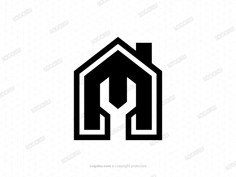
Letter M Wrench House Rooftop Monogram Logo. This Logo is formed from the composition of the letter M, house building and wrench repair tool icon. The combination of these elements produces a modern, elegant and reliable monogram. Bold, bold black line strokes create professional, powerful and easily recognizable silhouette visuals. This blend of engineering and architecture brings a solid, precise and reliable character.
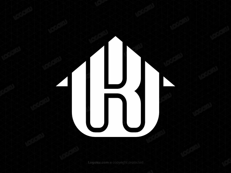
Letter KW Initial WK House Modern Line Monogram Logo. The main element of the logo is built by the letters K, W and house building. The design is created from strict geometric lines, displayed in white strokes on a black background, resulting in an elegant, clean and professional feel. The combination of the two letters creates a visual corporate identity that can be read as KW or WK. At the top, a silhouette of the roof of the house is formed with sharp corners and harmoniously integrated with the initials K. While the letter W acts as the main frame on the outside, which is connected to the roof of the House strengthens the impression of sturdy, strong and reliable.

Letter LC Initial CL Modern Line Identity Lettermark Logo. The Logo features two letters of the alphabet, consisting of L and C. The two are interconnected and overlap, resulting in a first name that can be read as LC or CL. The initials L appear as the main frame built from firm lines that are sturdy and stand upright, representing a strong, reliable and stable character. While on the inside, the letter C is created, which blends harmoniously with the main visual structure, presenting a modern, elegant and adaptive impression.


I designed this logo to highlight the connection between reliable security and modern urban development.
The porcupine’s portrait naturally embraces a cluster of geometric buildings creating a clean symbol of stability growth and long term investment.


Minimal Badger Shield Logo Design is a clean and modern emblem that combines the fearless spirit of a badger with the protective strength of a shield. Designed with bold geometric lines and a minimalist style, this versatile logo represents resilience, confidence, security, and reliability. Its timeless appearance makes it ideal for businesses seeking a professional and memorable brand identity.


An orange worm with a friendly face circles an apple rendered using a negative space style at the center; this design creates a warm and cheerful feel, while the negative space approach keeps the logo simple yet cute.

The logo features a stylized monochrome wolf's head with a friendly, smiling expression—a combination that conveys a character that is bold and strong yet welcoming and open. Rendered with bold lines, the wolf faces right with closed eyes and a warm, friendly smile, symbolizing a sense of warm protection.

I created this logo to convey the idea that a secure home is the foundation for lasting progress.
Combining the familiar shape of a hedgehog with a house and upward pointing geometric elements this design conveys security, stability and progress in a clean and memorable way.


A bold and minimalist eagle logo symbolizing strength, freedom, vision, and leadership in a timeless black and white design.
Cat Head Crown Power Geometric Line Logo. The Logo is a clever combination of a cat's head, a power button symbol and a crown. The combination of these three elements produces a visual mascot that reflects the impression of modern, bold and reliable. The design uses a geometric stylistic approach, which is built from a series of straight and curved lines in black on a white canvas. On the outside, a silhouette of cat ears with sharp corners connected to the face and mouth is created, depicting courage and agility. On the inside, the crown element is harmoniously integrated with the power button at the top, bringing an elegant meaning of power and complete control.
I designed this logo to combine the protective nature of a porcupine with the confidence of modern architecture.
The skyline naturally extends from the animal's body creating a distinctive symbol of security and long term progress.

A sophisticated and timeless AB monogram logo featuring clean lines, balanced typography, and a premium minimalist aesthetic. Designed for businesses, personal brands, financial firms, real estate, consulting, law firms, beauty brands, and luxury services. The logo emphasizes elegance, professionalism, and strong brand recognition with a refined modern style.

Bee Wifi Wireless Tech Geometric Line Logo. The Logo features a visual of a bee combined with a wifi icon. The combination of elements of nature and technology creates a visual work that is modern, innovative and natural. The design shows The Shape of a complete head with antennas harmoniously connected to both wings, built from a series of geometric lines in the form of soft and symmetrical arches and diagonals. In the middle to the bottom, there is a blue graded wifi signal Wave icon integrated with the Bee tail structure, making the logo look prominent, sharp and futuristic. Overall, the brand presents a bee as a symbol of hard work and solid cooperation. While the Wi-fi signal represents connectivity and communication that is fast, smooth and efficient.

A winged spear rises like a signal, part weapon, part badge of forward motion. The firm center axis holds the symbol steady, while the wings sweep outward to suggest speed and guarded strength. Stepped feather cuts add rhythm and make the silhouette read fast, then the upward spear point seals the message of aim and command. This Luxurious winged spear concept carries a mythic tone, echoing messengers and guardians from old stories, yet it stays clean and direct. It suits a brand that wants authority without noise.

Power reads first in this mark, because the Letter P holds its ground like a solid pillar, then turns into a smooth bowl that feels welcoming. Above it, crown notches add a hint of rank without noise, so the idea of leadership stays subtle. The design relies on strong geometry, flat cuts, and one steady weight, which helps the symbol feel confident and easy to remember. It is a simple monogram that can signal ownership, achievement, or a premium promise, while staying direct.
Built from controlled line geometry, this honeycomb inspired hexagon mark feels like a small system you can trust. The stacked angles read like a roof and a cell at the same time, suggesting shelter, structure, and careful work. A rounded notch at the center softens the edges and adds a quiet sense of flow, almost like nectar moving through a hive. The simple layout keeps the idea clear while the layered frames add depth without clutter.